Mirror
Digital Design
Brief
Mirror is a fictional clothing retailer that caters to consumers looking for cheap clothing for any occasions along the lines of their competitors H&M and Old Navy. While they have a strong offline presence, their online footprint is far from perfect. They would like to make a responsive site and they would also like a logo rebrand from the bottom up that would complement their online presence.
Research
Both primary and secondary research was used, including, but not limited to competitive analysis to better understand the landscape as well as what competitors are doing to distinguish their online footprint and marketing research to see what the current trends were for online retail and expected growth as well as typical demographic. In addition, surveys and 1-on-1 interviews were undertaken, talking with and asking questions from the consumer that would better inform the process of the site as well as the rest of the responsive views are built out and sent to development.
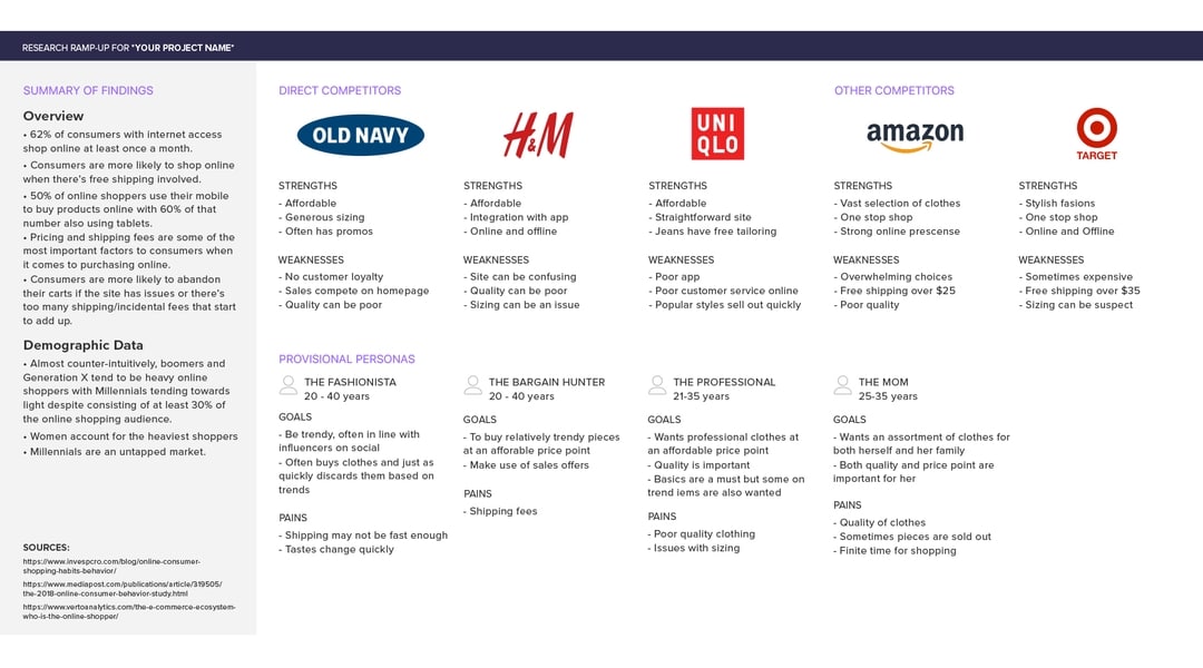
Research Phase - Competitive research
One of the tools for research, competitive analysis, examines competitors that align with the same or similar demographics and are generally in the same business sphere.
Synthesis of Data
Using the data gathered from the research phase, a better picture of the user came into being. Some of the noteworthy conclusions drawn from the research data was that online shopping is not only more commonplace, but also expected and that the price and fit were very important factors to the consumer. With use of various data-driven techniques such as personas, site maps and product road maps, a viable wireframe was able to be built that highlighted the results of the research.
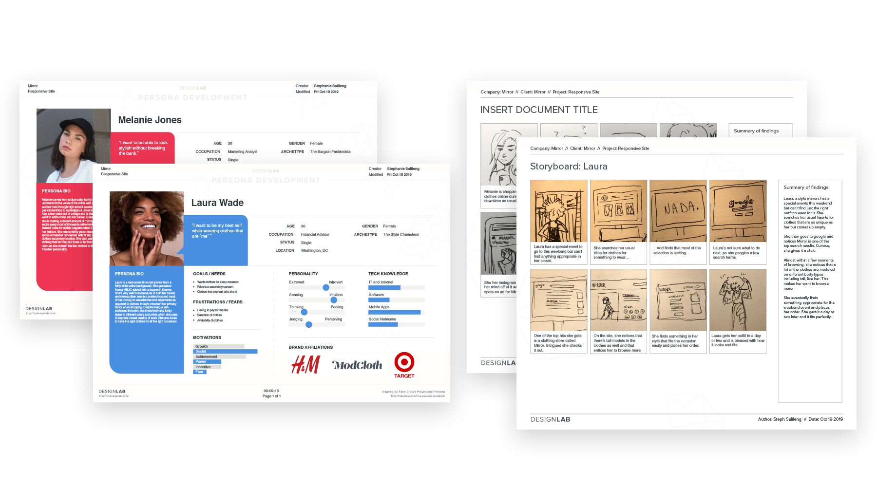
Synthesis Phase - Personas + Storyboards
For the initial stages of the project, personas based on acquired data from 1-on-1 interviews, surveys, and research, were created. These personas filled in for potential customers and each had their own distinct personality, attitudes, demographical information, etc. From there a storyboard outlining why they would use Mirror's online shop in their daily lives were built. These helped inform what would later evolve into the User and Task flows that would help steer the design.
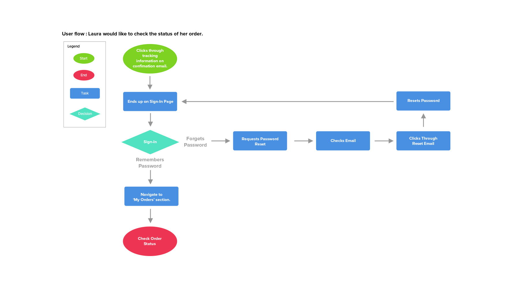
Synthesis Phase - User + Task flows
Pictured above is an example of a user flow used for Mirror. This is a flow-chart map that builds off the storyboards above. In it we can see the customer's line of thinking and make a logical inference as to the actions they'll take. It goes over a singular task the user has to make and the choices that would be presented to them. In this example, the persona "Laura" would like to check the status of her order. In addition to user flows, task flows were also created which were more general and simple (ie: How to navigate to a department) and drilled down at a higher level than the user flows.
Implementation
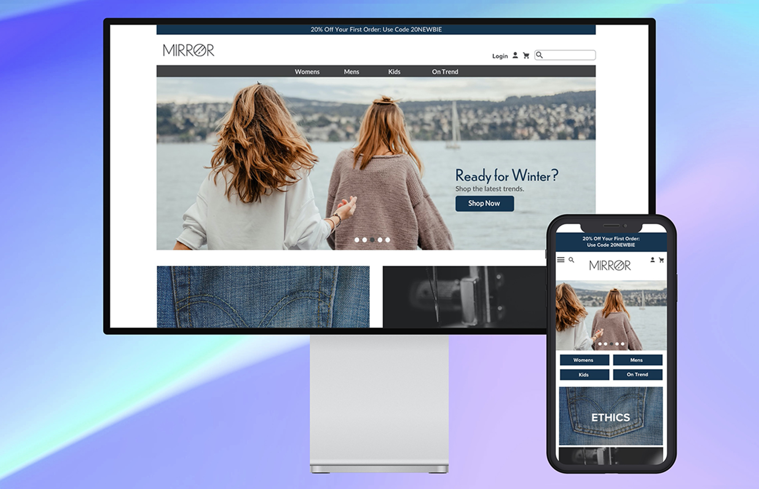
Because this website was built using existing assets, it was a matter of reusing them and making them cohesive together. The wireframes were built with that in mind and when the hi-fidelity comp was created, it still maintained the look and feel of the brand as a whole and cleaning it up.
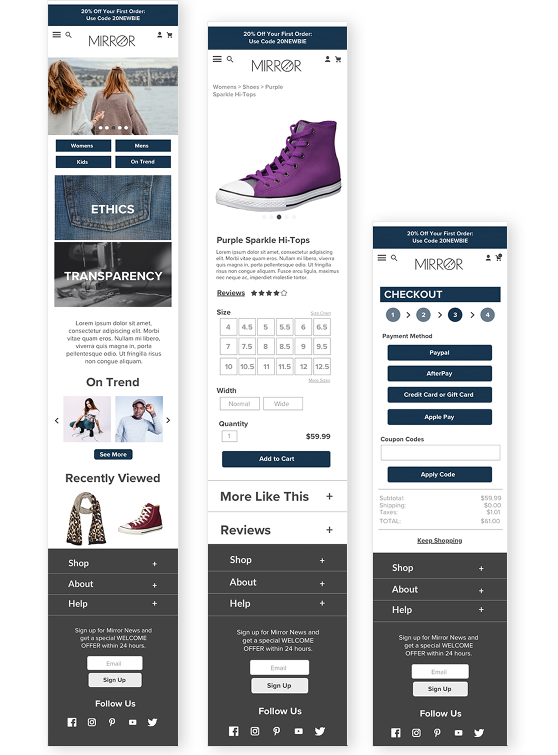
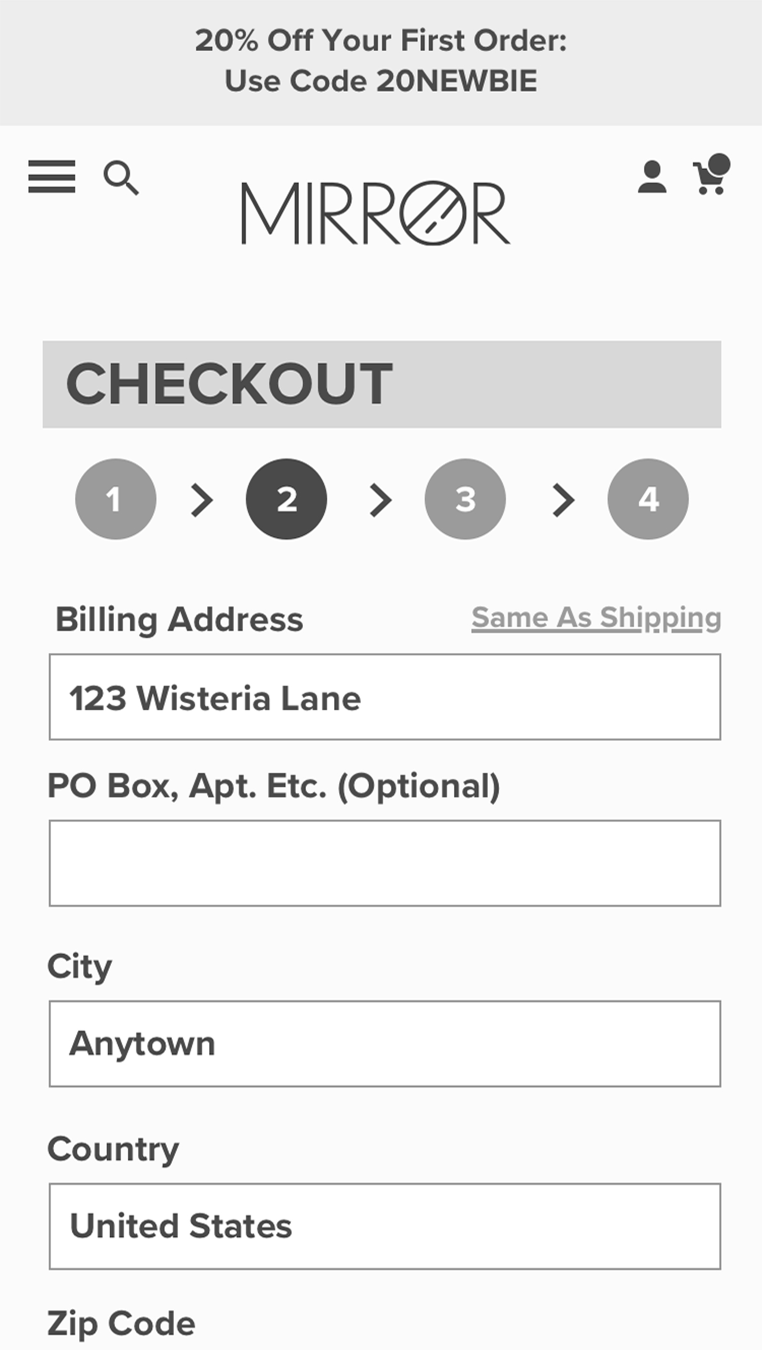
Implementation Phase - Wireframes + Testing
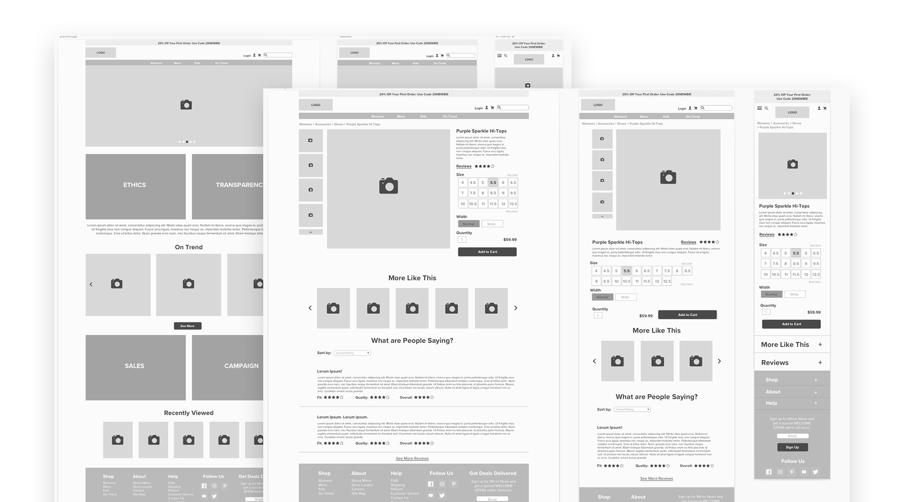
Based on the previous steps, a low-fidelity wireframe was created with a responsive layout in mind. It covers the breadth of desktop, tablet, and mobile and is the bare bones when it comes to functionality. It's meant to be an initial layout that's informed by the research, personas, as well as other things like the flows. From here, the design and flow is reassessed and a mid-fidelity prototype is built. Because most of the research mentioned in the beginning showed that most customers skewed towards shopping on their phones, only the mobile site is built for initial testing. From there, once the prototype is built, it was tested with real people who were tasked to complete certain actions on the prototype.
Testing
A task flow was created for the user that involved navigating on the mobile site to a specific department and adding a specific item to the cart and checking out. Several people were tested both remotely and in-person and the data was consolidated and analyzed. From there changes were made to the mobile site as well as a hi-fidelity comp being created based on an affinity map. Pain points included layout in the checkout process as well as a lack of alternate routes to get the task completed.
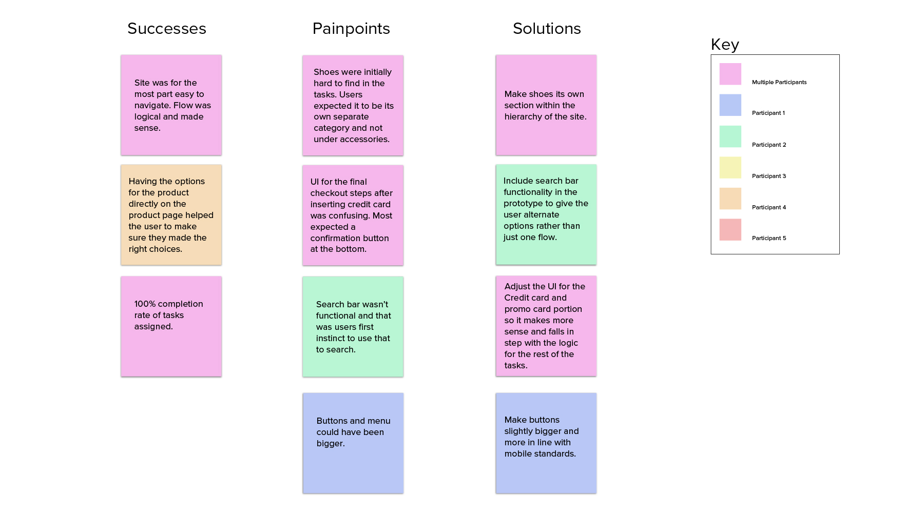
Testing Phase - Conclusions + Affinity Map
Based on notes and other observational tools such as video, conclusions can be drawn - Especially to consider what were successes in the prototype, where painpoints were located and the possible solutions to the painpoints. Using colors to represent one or all participants, a better overall picture could be painted, with multiple participant notes being indicative of a pattern.
Next Steps
The mid-fidelity is turned into a high fidelity prototype with all the painpoints addressed and anything that needs to be fixed adjusted. This is again sent for testing and upon success, the rest of the site as well as the rest of the responsive views are built out and sent to development.